| Automated charting and reporting |
Chart Samples
Style Examples
SharpLeaf Tutorials
Document Layout Tutorials
Text Flow Tutorials
Table Tutorials
Visual Glossaries
SharpPlot Reference
SharpPlot Class
SharpPlot Properties
SharpPlot Methods
SharpPlot Structures
SharpPlot Enumerations
PageMap Class
SharpLeaf Reference
SharpLeaf Class
SharpLeaf Properties
SharpLeaf Methods
Table Class
Table Properties
Table Methods
SharpLeaf Structures
FontType Structure
ParagraphStyle Structure
BoxStyle Structure
SharpLeaf Enumerations
DocumentLayout Classes
DocumentLayout Class
PageLayout Class
PageElement Abstract Class
Frame : PageElement Class
TextBlock : PageElement Class
ImageBlock : PageElement Class
Box : PageElement Class
Rule : PageElement Class
Common Reference
Document Class
VectorMath Class
DbUtil Class
Download
Release Notes
Licensing
SharpPlot Tutorials > General Tutorials > Creating a Business graphic
Creating a Business graphic
SharpPlot is shipped with sample.cs which illustrates many of the capabilities you need to generate effective business graphics. This short tutorial takes the chart step by step and explains the various properties and methods used to construct it.
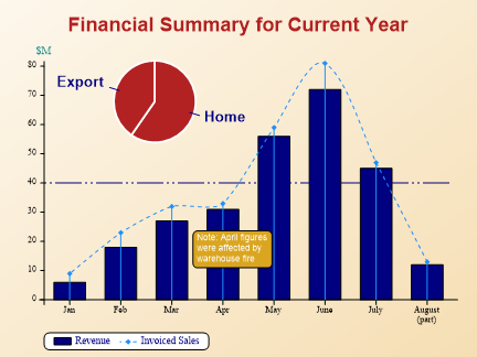
Here is the completed graphic, rendered to a Bitmap for inclusion in the help file.
Defining the data
// Data used in all the examples below
 data1 = new int[] {6,18,27,31,56,72,45,12};
 data2 = new int[] {9,23,32,33,59,81,47,13};
 xlabs = new string[]{"Jan","Feb","Mar","Apr","May","June","July","August\n(part)"};
These are the series used to draw the bars and the overlay line.
Step 1: a Simple Barchart

The first step is to set the chart heading, and to define the ‘paper’ with a suitable background color and fill pattern.
// First example with a barchart
 sp.Reset();
 sp.Heading = "Financial Summary for Current Year";
 sp.SetHeadingFont("Arial",18,FontStyle.Bold,Color.Firebrick);
// Use a simple shaded paper as background
 sp.SetBackground(Color.Wheat,FillStyle.Solid);
 sp.MarginTop = 56;  // Leave a lttle more headspace
 sp.YCaption = "$M";
 sp.YAxisStyle = YAxisStyles.ForceZero|YAxisStyles.AtEndCaption;
 sp.SetXLabels(xlabs);
 sp.DrawBarChart(data1);
The heading is a simple string property, which may contain newline characters. The ‘font’ is actually a composite of the font face, the point-size, the style and the color. Any combination of these may be given – the other elements retain their current settings. Note that you can give a list of font faces here, for example “Verdana,Arial,sans” would be fine for a chart destined to be rendered to VML or SVG.
This example also sets a slightly generous top margin, and places the Y-axis caption at the end of the axis, rather than in its default location which is written vertically alongside the axis. The X-axis labels are set with an array of labels (passed as strings) which again may contain embedded newlines.
Finally, you may have noticed that the Y-axis has been forced to range from zero, rather than taking the default lower limit from the data.
Step 2: Overlaying a LineGraph

The second step illustrates an important feature of the way SharpPlot retains state information. As soon as you draw a chart, you effectively fix the range of the X and Y axes from the given data. These axes can then be re-used over and over again by further charts, in this case a linegraph which shares the same X and Y scales.
// Overlay a linegraph on the same axis set
 sp.SetLineStyles(LineStyle.Dash);
 sp.SetColors(Color.DodgerBlue);
 sp.DrawLineGraph(data2);
SharpPlot works with the concept of color and LineStyle cycles, so you can pass an array of colors or line-styles here. If you are only plotting a single series (as here) then a single color and line-style are all you need.
As you can see, the line is a little lightweight visually, so it is given a much stronger presence in Step-3.
Step 3: Customising the Line
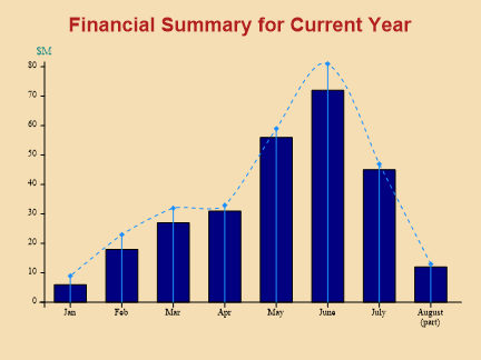
That looks better!
sp.LineGraphStyle = LineGraphStyles.Markers|LineGraphStyles.Risers|LineGraphStyles.Curves;
sp.SetLineStyles(LineStyle.Dash);
sp.SetMarkers(Marker.Lozenge);
sp.SetColors(Color.DodgerBlue);
sp.SetPenWidths(0.8);  // For line and risers
sp.Flexibility = 5;  // For curved line
sp.DrawLineGraph(data2);
The main change is to increase the pen-width (again you may set an array here for multiple series), add Risers from the axis to lozenge-shaped markers, and join the points with a smooth curve.
Step 4: adding a Datumline and a Legend
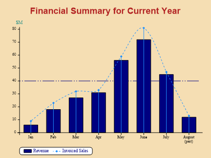
This shows an example of a Datum line, which has been defined with a customised dash-repeat.
sp.SetDatumLineStyle(Color.Navy,new LineStyle(new int[] {24,3,2,3,2,3}));
sp.SetYDatumLines(40);
You can set a single datum-line (as here) or an array of lines to draw horizontals at multiple Y-values.
This chart also has a simple legend, which describes both series.
// Key picks up series info from both charts
 sp.SetKeyText(new string[]{"Revenue","Invoiced Sales"});
 sp.KeyStyle = KeyStyles.Boxed|KeyStyles.Rounded;
Each time you call one of the SharpPlot ‘Draw’ routines, information about the series is automatically added to the key. All you need to do is to add some text describing each bar or line, and an appropriate legend will be created for you.
Step 5: Adding a Summary Piechart
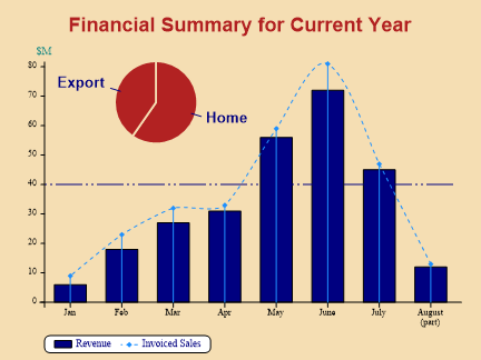
Piecharts are treated by SharpPlot as ‘rolled-up’ barcharts, so they have X-labels. Again, you can set an array of colours here, which are used one-per-sector, running clockwise from 12:00.
sp.SetXLabelFont("Arial",13.4,FontStyle.Bold,Color.Navy);
sp.SetXLabels(new string[]{"Home","Export"});
sp.SetPieCenter(100,180);
sp.PieRadius = 50;
sp.SetEdgeStyle(Color.Wheat,LineStyle.Solid,1.2);
sp.SetColors(Color.Firebrick);
sp.DrawPieChart(new int[] {34,23});
Having set up the labels and colors, we can place the pie at a specific (x,y) location and reduce its radius to half the default value. It can be edged with a thick line in the current background colour to blend in nicely with the whole graphic.
sp.SetXLabelFont("Arial",13.4,FontStyle.Bold,Color.Navy);
sp.SetXLabels(new string[]{"Home","Export"});
sp.SetPieCenter(100,180);
sp.PieRadius = 50;
sp.SetEdgeStyle(Color.Wheat,LineStyle.Solid,1.2);
sp.SetColors(Color.Firebrick);
sp.DrawPieChart(new int[] {34,23});
Step 6: Graded Background and a Text Note
This illustrates another of the built-in gradient fills, this time shading towards white from the bottom-right corner.
It also adds a text note – you can write as many notes as you like, using either chart co-ordinates (as here) or absolute positioning.
sp.NoteStyle = NoteStyles.Boxed|NoteStyles.Rounded;
sp.SetNoteBackground(Color.Goldenrod);
sp.SetNoteFont(Color.White);
sp.DrawNote("Note: April figures were affected by warehouse fire",3.5,20,0,1.6);
The note is boxed, and you can set the fill-style and color of the background. In this case the font is left to its default (Arial) but changed to white. The text will wrap into a box 1.6 X-axis units wide starting at x-value 3.5 and y-value 20.
Summary
This tutorial illustrates many of the basic techniques for producing effective business graphics with SharpPlot. The next tutorial shows how you can associate hyperlinks and JavaScript handlers with your series to make the graphs part of a real user-interface on the web.