| Automated charting and reporting |
General Tutorials
Style Examples
SharpLeaf Tutorials
Document Layout Tutorials
Text Flow Tutorials
Table Tutorials
Visual Glossaries
SharpPlot Reference
SharpPlot Class
SharpPlot Properties
SharpPlot Methods
SharpPlot Structures
SharpPlot Enumerations
PageMap Class
SharpLeaf Reference
SharpLeaf Class
SharpLeaf Properties
SharpLeaf Methods
Table Class
Table Properties
Table Methods
SharpLeaf Structures
FontType Structure
ParagraphStyle Structure
BoxStyle Structure
SharpLeaf Enumerations
DocumentLayout Classes
DocumentLayout Class
PageLayout Class
PageElement Abstract Class
Frame : PageElement Class
TextBlock : PageElement Class
ImageBlock : PageElement Class
Box : PageElement Class
Rule : PageElement Class
Common Reference
Document Class
VectorMath Class
DbUtil Class
Download
Release Notes
Licensing
SharpPlot Tutorials > Chart Samples > Histograms for distributions
Histograms for distributions
All the examples which follow use the same set of values – the sum of three dice, thrown repeatedly. Clearly the range will vary from 3 to 18, with the more likely values falling in the middle.
Aggregating a Set of Samples
This first chart takes most of the SharpPlot defaults as they come and simply displays the distribution of samples.
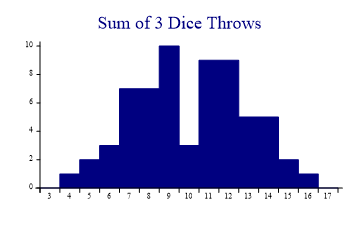
sp.Heading = "Sum of 3 Dice Throws";
threedice = new int[] {9,8,6,11,9,14,11,8,9,14,12,7,6,11,15,14,11,7,5,8,7,9,6,7,12,
         7,13,8,9,13,7,7,8,12,11,16,12,9,11,12,12,12,9,14,8,9,13,11,10,13,11,13,9,
         10,10,4,14,8,9,11,12,5,12,15};
sp.HistogramStyle = HistogramStyles.SurfaceShading;
sp.SetXRange(3,18);
sp.XAxisStyle = XAxisStyles.MiddleLabels;
sp.DrawHistogram(threedice);
With integer data (one ‘bin’ per value) it clearly makes sense to label the bars, rather than the tickmarks. For some reason, thise set of throws produced very few 10s, but is otherwise unremarkable.
Grouping into Class Intervals
This example aggregates the same data into groups 2-4, 4-6 and so on. The groups are all labelled (including the groups with zero count, as this is perfectly valid data here).
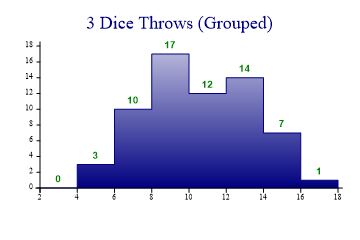
sp.Heading = "3 Dice Throws (Grouped)";
sp.HistogramStyle = HistogramStyles.SurfaceShading|HistogramStyles.ValueTags;
sp.SetFillStyles(FillStyle.GradientBottom);
sp.SetValueFont("Arial",10,FontStyle.Bold);

sp.SetXRange(3,18);
sp.ClassInterval = 2;
sp.SetXTickMarks(2);

sp.DrawHistogram(threedice);
Very Plain, with Exploded Axes
This example is a style of histogram often seen in statistical journals.
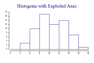
sp.Heading = "Histogram with Exploded Axes";
sp.HistogramStyle = HistogramStyles.Risers|HistogramStyles.ExplodeAxes;

sp.SetXRange(3,18);
sp.ClassInterval = 2;
sp.SetXTickMarks(2);

sp.DrawHistogram(threedice);
Overlayed Normal Curve
The final example draws a theoretical bellcurve centred on the mean.
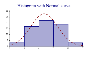
sp.Heading = "Histogram with Normal curve";
sp.HistogramStyle = HistogramStyles.SurfaceShading|HistogramStyles.Risers|
         HistogramStyles.NormalCurve;
sp.SetFillStyles(FillStyle.Halftone);
sp.SetPenWidths(2);

sp.SetXRange(3,18);
sp.ClassInterval = 3;
sp.SetXTickMarks(3);

sp.DrawHistogram(threedice);
Datumlines or an XZone could be added to show the ‘range’ of the data, typically the mean +/- 2 standard deviations.