| Automated charting and reporting |
SharpPlot Tutorials
General Tutorials
Chart Samples
Style Examples
SharpLeaf Tutorials
Document Layout Tutorials
Text Flow Tutorials
Table Tutorials
Visual Glossaries
SharpPlot Class
SharpPlot Properties
SharpPlot Structures
SharpPlot Enumerations
PageMap Class
SharpLeaf Reference
SharpLeaf Class
SharpLeaf Properties
SharpLeaf Methods
Table Class
Table Properties
Table Methods
SharpLeaf Structures
FontType Structure
ParagraphStyle Structure
BoxStyle Structure
SharpLeaf Enumerations
DocumentLayout Classes
DocumentLayout Class
PageLayout Class
PageElement Abstract Class
Frame : PageElement Class
TextBlock : PageElement Class
ImageBlock : PageElement Class
Box : PageElement Class
Rule : PageElement Class
Common Reference
Document Class
VectorMath Class
DbUtil Class
Download
Release Notes
Licensing
SharpPlot Reference > SharpPlot Methods > DrawHistogram Method
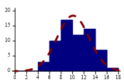
SharpPlot.DrawHistogram Method
Construct a histogram plot from data and class-interval property.
Example
sp = new SharpPlot(180,120);
sp.SetMargins(12,12,18,4);
threedice = new int[] {9,8,6,11,9,14,11,8,9,14,12,7,6,11,15,14,11,7,5,8,7,9,6,7,12,
         7,13,8,9,13,7,7,8,12,11,16,12,9,11,12,12,12,9,14,8,9,13,11,10,13,11,13,9,
         10,10,4,14,8,9,11,12,5,12,15};
sp.HistogramStyle = HistogramStyles.NormalCurve|HistogramStyles.SurfaceShading;
sp.SetXRange(0,18);
sp.ClassInterval = 2;
sp.SetPenWidths(new int[] {1,3});
sp.DrawHistogram(threedice);
The short tutorial illustrates several ways to display a typical frequency distribution.
Overloads
Description
The Histogram does one very simple job – it takes a large sample of values and shows how they are grouped. Many samples of data turn out to follow a bell-shaped curve called the Normal distribution (the test data used in the tutorial simply sums several throws of 3 dice which follows this shape very well), but often the shape of the plot gives some useful clues which can be hidden simply by looking at statistics such as the Mean or Range.
Histograms can be drawn with a fitted Normal curve, which is often a good way to check if the underlying data really does have the assumed distribution.
See also ...
Histograms for distributions | SharpPlot Members | SharpPlot.HistogramStyle Property