| Automated charting and reporting |
General Tutorials
Style Examples
SharpLeaf Tutorials
Document Layout Tutorials
Text Flow Tutorials
Table Tutorials
Visual Glossaries
SharpPlot Reference
SharpPlot Class
SharpPlot Properties
SharpPlot Methods
SharpPlot Structures
SharpPlot Enumerations
PageMap Class
SharpLeaf Reference
SharpLeaf Class
SharpLeaf Properties
SharpLeaf Methods
Table Class
Table Properties
Table Methods
SharpLeaf Structures
FontType Structure
ParagraphStyle Structure
BoxStyle Structure
SharpLeaf Enumerations
DocumentLayout Classes
DocumentLayout Class
PageLayout Class
PageElement Abstract Class
Frame : PageElement Class
TextBlock : PageElement Class
ImageBlock : PageElement Class
Box : PageElement Class
Rule : PageElement Class
Common Reference
Document Class
VectorMath Class
DbUtil Class
Download
Release Notes
Licensing
SharpPlot Tutorials > Chart Samples > Multiples for small thumbnails
Multiples for small thumbnails
One of the best innovations in Tufte’s “The Visual Display of Quantitative Information” is the idea of using an array of miniature charts to display multi-dimensional data. Often a series of values are recorded at (say) several sites or on several days, then are superimposed on a single chart as a collection of dotted and dashed lines in various colors. This often makes it very hard to see the patterns and relationships in the data.
The ‘Multiple’ plots each series on its own chart, and arranges them automatically in a trellis to allow easy comparison between them.
Comparing two datasets
This example is the simplest form of multiple chart. Two sets of data are compared by being plotted side-by-side as barcharts. Note that the multiple chart has very few styles of its own – here the example uses the YAxisStyle to have both charts constrained to show the zero point.
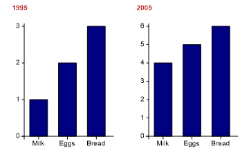
data = new int[][]{new int[]{1,2,3},new int[]{4,5,6}};

sp.SetPageLabels(new string[]{"1995","2005"});
sp.SetXLabels(new string[]{"Milk","Eggs","Bread"});

sp.YAxisStyle = YAxisStyles.ForceZero;
sp.SetLabelFont("Arial",13);
sp.SetCaptionFont("Arial",15,FontStyle.Bold,Color.Firebrick);

sp.DrawMultiple(ChartType.BarChart,data);
PageLabels are a useful way of labelling the cells in the trellis.
A Collection of Histograms
The barley yield data could be shown on a single histogram, but often this conceals some systematic variation in the data. In this example, the farm is used to create a trellis of charts, each showing the spread of the data at the individual farms.
Although the experiment was designed to investigate various barley varieties, this plot makes it very clear that the farm is going to be a big factor in the outcome. A quick glance shows that yields at Wasaca may be quite variable, but that it easily beats both Grand Rapids and Duluth (which is consistently very poor).
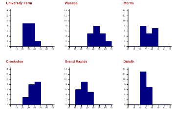
sp.SplitBy(barleyfarm);  // One cell per farm

sp.HistogramStyle = HistogramStyles.SurfaceShading;
sp.ClassInterval = 10;
sp.SetXRange(0,70);
sp.SetYRange(14);

sp.SetCaptionFont("Arial",14,FontStyle.Bold,Color.Firebrick);
sp.DrawMultiple(ChartType.Histogram,barleyyield);
The PageLabels have been automatically set to reflect the unique values in the dimension used to split the data.
Constructing a dashboard
This example automates a typical use of the dial chart, which are often grouped in arrays to show related values.
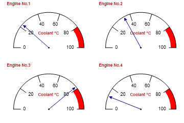
sp.SetXRange(0,100);
sp.SetXZones(new Zone(80,100,Color.Red,FillStyle.Solid));
sp.SetPenWidths(1.5);
sp.DialChartStyle = DialChartStyles.ArrowLines;

sp.SetPageLabels(new string[]{"Engine No.1","Engine No.2","Engine No.3","Engine No.4"});
sp.XCaption = "Coolant °C";

sp.SetLabelFont("Arial",13);
sp.SetCaptionFont("Arial",15,FontStyle.Bold,Color.Firebrick);

sp.DrawMultiple(ChartType.DialChart,new int[]{23,34,78,12});
Note that the range and warning zone will be common to all the charts in the trellis.
Comparing several attributes
The final example shows a collection of polar charts, which readily allow various criteria to be compared across several cameras (the example came from a Swiss camera magazine). Notice how the distinct set of camera types is automatically used as page-labels to caption each chart in the trellis.
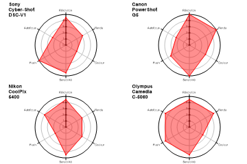
sp.SetMargins(36,12,20,0);

cameradata = new double[] {4.5,3.1,2,4.5,5,2.5,5,5,3,5,3.5,2.5,4.5,3,3,4.5,2,4,4.5,
         4.5,2.5,4.5,4.5,4.5};
cameratype = new int[] {1,1,1,1,1,1,2,2,2,2,2,2,3,3,3,3,3,3,4,4,4,4,4,4};
cameranames = new string[]{"Sony\nCyber-Shot\nDSC-V1","Canon\nPowerShot\nG5",
         "Nikon\nCoolPix\n5400","Olympus\nCamedia\nC-5060"};
cameracap = new string[]{"Résolution","Rendu","Couleur","Sensibilité","Flash",
         "Autofocus","Rapidité"};

sp.SplitBy(cameratype);  // Sets trellis
sp.SetPageLabels(cameranames);  // Sets cell labels

sp.SetFillStyles(FillStyle.Opacity42);
sp.SetColors(Color.Red);
sp.SetMarkers(Marker.SmallBullet);
sp.SetLineStyles(LineStyle.Solid);
sp.SetPenWidths(1);

sp.PolarChartStyle = PolarChartStyles.SurfaceShading|PolarChartStyles.GridLines|
         PolarChartStyles.Markers;
sp.YAxisStyle = YAxisStyles.ForceZero;
sp.SetXLabels(cameracap);
sp.XLabelFormat = "XXXXXXXX;";
sp.SetLabelFont("Arial",6,Color.Black);
sp.SetCaptionFont("Arial",14,FontStyle.Bold,Color.Black);

sp.DrawMultiple(ChartType.PolarChart,cameradata);
This is likely to make visual comparison much easier than attempting to overlay the radar plots from several cameras on the same chart.