| Automated charting and reporting |
Chart Samples
Style Examples
SharpLeaf Tutorials
Document Layout Tutorials
Text Flow Tutorials
Table Tutorials
Visual Glossaries
SharpPlot Reference
SharpPlot Class
SharpPlot Properties
SharpPlot Methods
SharpPlot Structures
SharpPlot Enumerations
PageMap Class
SharpLeaf Reference
SharpLeaf Class
SharpLeaf Properties
SharpLeaf Methods
Table Class
Table Properties
Table Methods
SharpLeaf Structures
FontType Structure
ParagraphStyle Structure
BoxStyle Structure
SharpLeaf Enumerations
DocumentLayout Classes
DocumentLayout Class
PageLayout Class
PageElement Abstract Class
Frame : PageElement Class
TextBlock : PageElement Class
ImageBlock : PageElement Class
Box : PageElement Class
Rule : PageElement Class
Common Reference
Document Class
VectorMath Class
DbUtil Class
Download
Release Notes
Licensing
SharpPlot Tutorials > General Tutorials > Visual Glossary
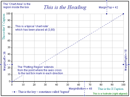
Visual Glossary
Most of the basic chart terms are illustrated here.
Paper
The entire region available for drawing the chart. It comprises the chart area and the gutter that surrounds it. The width and height can be set explicitly when you create a SharpPlot instance. The settings for color, fill style and thickness of the border line can be adjusted through the SetBackground method.
Gutter
The region lying between the edge of the paper and the chart area. The gutter has a uniform depth and, if the Gutter property is set to zero, the paper and chart area have identical dimensions.
Chart Area
The entire region used for the chart, axes, headings and so on. By default, its dimensions are the paper size less the gutter, but the NewFrame method can be used to alter the size of chart area. The settings for color, fill style and thickness of the border line can be changed through the SetFrameBackground method to create, for example, a ‘boxed’ chart (as in the diagram) where a thick line is drawn around it. The chart area that lies outside of the plotting region and that contains the heading, subheading and footnotes is known as the frame. The DrawFrame method can be used to draw this separately, which is useful when, for example, you want to draw several smaller charts on a single piece of paper.
Plotting Region
The rectangle formed by the X and Y axes, stretching between the first and last tick marks in each direction. By default, SharpPlot will leave this clear of all elements except plotted data, but you can choose to place the key here, or to add text notes after the plot is complete. The settings for plotting region color, fill style and thickness of the border line can be modified through the SetChartBackground method.
Margins
The area outside the plotting region up to the boundary of the chart area. By default SharpPlot leaves space for the Y-axis on the left (with labels of up to four digits), the X-axis and key at the foot, and a one-line heading at the top. If you require longer labels or a deeper heading, you will probably need to adjust these settings with the Margins property. This gives the (top,bottom,left,right) margins as shown, or you can set the margins individually with MarginTop and so on. All values are in points.
Chart Heading
The main title for the chart. By default this is written centred at the top of the chart, but you can place it as required by setting the heading style.
Axis Captions
You can set captions for any of the X, Y and Z axes. You can also choose, for example, to have (short) Y-axis captions written horizontally at the end of the axis rather than up the side by setting YAxisStyle.
Axis Labels
These are written at each tick mark. By default, SharpPlot uses numeric labels, but you can scale, format, or over-ride these as required. You can also choose to have the X-axis labels written midway between tick marks, which is often suitable for weekly or monthly data.
Grid Lines
These are lightly-drawn horizontals and verticals which extend from the major tickmarks across the plotting region.
Baseline
This determines how barcharts and surface charts are shaded. You can leave the X-axis at the bottom and set a baseline part-way up the Y-axis to give the effect of bars which ‘hang’ from a norm, or to shade above and below a standard setting.
Key or Legend
This is written (by default) across the foot of the chart, and shows a small sample of the colour / marker / fill style for each line or bar, with a short section of explanatory text beside it. You can place the key anywhere within the chart area or margins, and multiple charts may share a single key.
Value Tags
Scatter plots, piecharts and barcharts may be annotated with data values. For scatter plots these are simple numeric values written beside each data point, for barcharts you can choose to write them on top of each bar or just inside the bar, and for piecharts they will normally be written around the edge of the pie using radial ‘spider’ tags from each segment.
Chart Notes
You can add free text (optionally boxed) anywhere within the chart area. Notes are positioned using the (x,y) coordinates of the last chart plotted, except for piecharts where the plotting region has a notional coordinate system of 0 – 100 in both directions.
Nudge
The position of the Chart Heading, Key, Chart Notes and Value Tags can be shifted in the X- and Y-dimensions through the corresponding nudge property.
Datum Lines
These are normally added after the plot is complete to mark important ‘cut off’ lines, such as +/- 2 standard deviations on a control chart.
Data Analysis
Some charts have one or more styles that use regression (GrowthCurve, ModelFit) or Gaussian smoothing (TrendLine) to calculate and draw a line that best fits the data.
Walls
These are the YZ, XZ and XY backplanes of a 3D chart. The settings can be altered with the SetWallFillStyles method.