| Automated charting and reporting |
General Tutorials
Style Examples
SharpLeaf Tutorials
Document Layout Tutorials
Text Flow Tutorials
Table Tutorials
Visual Glossaries
SharpPlot Reference
SharpPlot Class
SharpPlot Properties
SharpPlot Methods
SharpPlot Structures
SharpPlot Enumerations
PageMap Class
SharpLeaf Reference
SharpLeaf Class
SharpLeaf Properties
SharpLeaf Methods
Table Class
Table Properties
Table Methods
SharpLeaf Structures
FontType Structure
ParagraphStyle Structure
BoxStyle Structure
SharpLeaf Enumerations
DocumentLayout Classes
DocumentLayout Class
PageLayout Class
PageElement Abstract Class
Frame : PageElement Class
TextBlock : PageElement Class
ImageBlock : PageElement Class
Box : PageElement Class
Rule : PageElement Class
Common Reference
Document Class
VectorMath Class
DbUtil Class
Download
Release Notes
Licensing
SharpPlot Tutorials > Chart Samples > Box-and-Whisker plots for multivariate data
Box-and-Whisker plots for multivariate data
A selection of simple Box-and-Whisker charts are developed here, all using a ‘classic’ dataset from the 1930s showing barley yields at various farms in Canada. The trials were made at 6 farms over 2 years, with 10 varieties of barley, giving 120 data-points in total. The entier dataset can be found here.
The object of the trial was to see what the significant effects were, and the boxplot is an ideal way to explore relationships between variables. You might also check on the histograms of various subsets of the data, maybe using a Multiple chart to split the data by various criteria.
Spread of a single series
This chart simple takes the entire yield vector, and determines the ‘shape’ of the distribution.

sp.Heading = "Barley Yield (uncategorised)";
sp.SetColors(Color.Orange);
sp.XAxisStyle = XAxisStyles.ForceZero;
sp.YAxisStyle = YAxisStyles.NoAxis;
sp.BoxPlotStyle = BoxPlotStyles.Horizontal;
sp.DrawBoxPlot(barleyyield);
The chart shows the Median yield is about 32kg per acre, with 75% of the values falling in the range 26-42. There are outliers on both sides, and the shape of the data looks a little skewed. SharpPlot has been told not to draw a Y-Axis here, as the vertical dimension is meaningless.
Two categories, to compare distributions
The first obvious question to ask would be “were the years comparable?”. This is easily answered by splitting the dataset by year and repeating the chart.
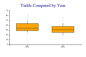
sp.Heading = "Yields Compared by Year";
sp.SetColors(Color.Orange);
sp.YAxisStyle = YAxisStyles.ForceZero;
sp.BoxPlotStyle = BoxPlotStyles.DecileWhiskers;
sp.DrawBoxPlot(barleyyield,barleyyear);
Note that the BoxPlot call now has 2 arguments, the first is the data, and the second the categorisation. This example is drawn with ‘Deciles’ shown in the whiskers, which indicate that the lower end of the range has a few outlying values. However it is fairly clear that there was not a big difference between the years.
Several categories, drawn horizontally
So maybe the farm was an important factor? Let’s try passing the farm name as the category, using a horizontal plot to leave plenty of room for the long names.

sp.SetBackground(Color.White,FillStyle.Solid);

sp.MarginLeft = 72;
sp.Heading = "Yields by Farm";
sp.SetColors(Color.Orange);
sp.XAxisStyle = XAxisStyles.ForceZero;
sp.BoxPlotStyle = BoxPlotStyles.Horizontal;
sp.DrawBoxPlot(barleyyield,barleyfarm);
That looks clear enough! The best yield at Duluth is barely up to the poorest result at Waseca. Some farms are also much more variable, so maybe we should look at combinations of variables as well as a single factor.
Vertical, using a 2-way split
This chart takes another approach to the names, setting up a format string to force them to wrap nicely between the tickmarks. Two categories are given – the first spreads the data across the X-axis as before and the second (or inner category) adds an extra level of fine structure which is annotated automatically in the chart legend.

sp.Heading = "Yield Split by Farm and by Year";
sp.SetColors(new Color[]{Color.Orange,Color.GreenYellow});
sp.YAxisStyle = YAxisStyles.ForceZero;
sp.XAxisStyle = XAxisStyles.MiddleLabels|XAxisStyles.GridLines;
sp.BoxPlotStyle = BoxPlotStyles.TicksBetween;
sp.XLabelFormat = "XXXXXX;";
sp.DrawBoxPlot(barleyyield,barleyfarm,barleyyear);
Interestingly, there were very big variations by year but they were very different at the different farms, so the simplistic split by year completely masked the effect. This style of chart makes the effect very clear indeed.
Summary
Boxplots are an excellent tool for exploring a complex dataset with many factors contributing to a single outcome. SharpPlot makes it easy to slice the data any way you like to bring the important variables to the fore.